Essay
←Back to blogGoogle Redesigned Material Again. My Widgets Are Having an Identity Crisis.
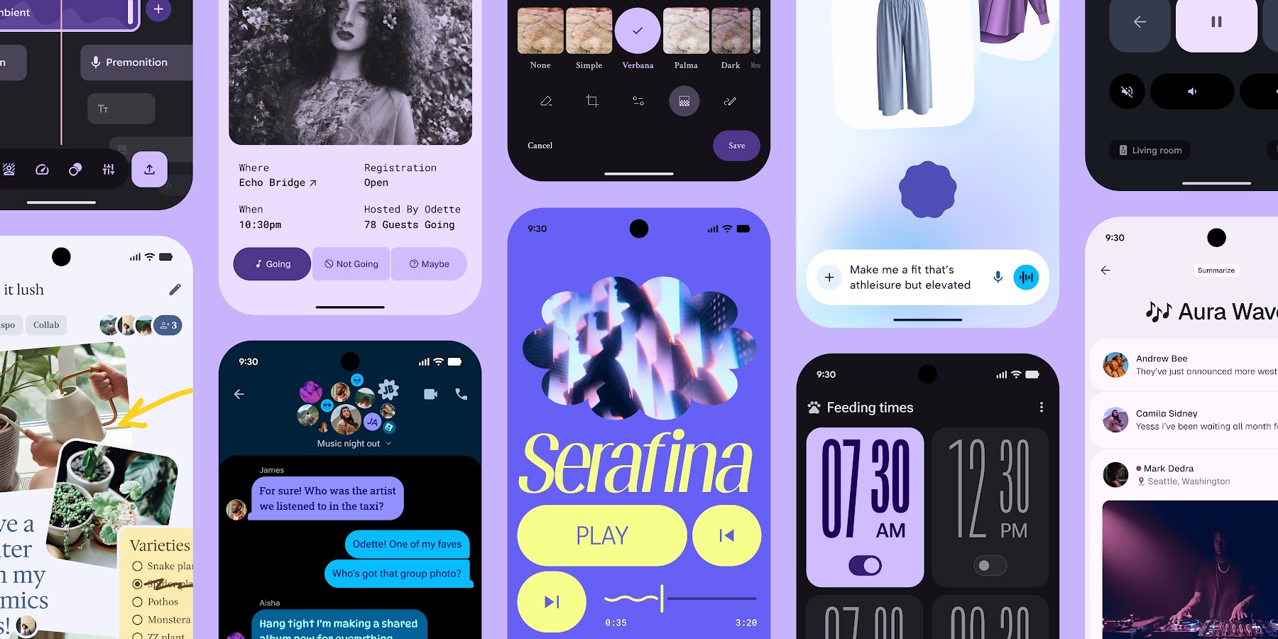
Material 3 Expressive dropped in 2025 with spring physics, morphing shapes, and wavy loaders. My hardcoded BorderRadius.circular(8) buttons filed for emotional support.
Google Redesigned Material Again. My Widgets Are Having an Identity Crisis.
"If your app doesn't morph, bounce, or use 15 different shades of mauve, are you even designing in 2026?"
Let's be honest: most Flutter apps look exactly like someone ran flutter create, added a few Center widgets, picked a primary color, and shipped it. Standard pill buttons. Standard app bar. Standard "I copied this directly from a 2021 tutorial and never looked back" energy.
It's everywhere. Your users notice. They just haven't uninstalled you yet.
Google's answer arrived in May 2025: Material 3 Expressive (M3E). The most research-backed update to Material Design ever shipped. Specifically engineered for the crime of playing it safe. If your buttons don't have spring physics and your containers are still hardcoded to BorderRadius.circular(8), M3E is here to make that feel embarrassing.
The "I'm Not Reading 80 Pages of Design Spec" Summary
M3E — announced May 2025, still dodging mainstream adoption in 2026 because change is hard and CircularProgressIndicator technically works — is not a theme change. It's a fundamental shift in how interfaces feel. Four-point cheat sheet:
- Color with purpose: Not "make the button blue." Using bold container colors to actively guide the user's eye instead of hoping they find the CTA themselves.
- Shape flexibility: Buttons that morph. Containers that aren't just rectangles. Expressive active indicators.
BorderRadius.circular(8)is retired. Let it go. - Springy physics: Spatial Springs for movement, Effects Springs for color transitions. Real objects bounce when you tap them. Linear
easeInOutcurves make your UI feel like a PowerPoint. Choose accordingly. - New components: Button groups, split buttons, wavy loading indicators. Yes, the wavy loader. It makes waiting for a network response feel almost deliberate.
My Buttons, Before and After
Before M3E: ElevatedButton with default styling. Technically a button. Communicates nothing about the emotional investment required to tap it.
After M3E: The same action, but the button has a physical presence. It responds. It has opinions about being pressed. Users notice this without being able to articulate why.
The research backs this up — M3E components tested higher for perceived quality, trustworthiness, and "this app was made by someone who cared." You can argue about whether spring physics are necessary. You cannot argue with conversion metrics.
The Components You're Still Not Using
The Wavy Loader (Upgrade From the Circle of Shame)
The standard CircularProgressIndicator says: "something is happening, probably, we'll see."
M3E's wavy loader says: "we are actively working on this and the app has not frozen."
These are meaningfully different messages. The wavy one looks alive. Ship the wavy one.
Button Groups and Split Buttons
Finally, grouped actions that don't look like you threw four individual buttons into a Row and called it done. Split buttons give you a primary action with an overflow option that stays in visual context. No more "wait, where's the secondary action" UX archaeology.
Spatial Springs and Effects Springs
Curves.easeInOut is retired. We are doing physics now.
Spatial Springs handle movement — the kind of bounce when an element enters or responds to a tap that makes the interaction feel physical rather than programmatic. Effects Springs handle color transitions — fades that feel organic rather than linear.
The math is non-trivial. The result is that your app feels premium without anyone being able to explain why. That's the goal.
The Workflow: Skip the Spec, Use an Agent
You could spend three days in the Material spec. Or you could point the material3-expressive-flutter skill at your AI coding agent and start shipping while it handles the implementation.
I've been using this skill to bridge the gap while official Flutter SDK support finishes catching up to the spec. It gives your agent the exact context needed to implement components correctly — not hallucinated approximations, not components that look close but break on the fourth interaction.
_Actual footage of me shipping features faster than the Flutter team updates their changelog._How to Get Started (Four Real Steps)
- Enable Material 3:
useMaterial3: truein yourThemeData. Non-negotiable table stakes. - Use
ColorScheme.fromSeed: Stop manually typing hex codes. Dynamic palettes exist. Let them work. - Point your agent at the skill: The
material3-expressive-flutterreference files cover the components that aren't in the SDK yet. Force it to read the spec so you don't have to. - Embrace shape morphing: Use the shape packages.
BorderRadius.circular(8)has had a good run. It's done now.
The Result
When you combine M3E principles with proper motion physics, you get an app that feels like it was made on purpose. No more "this looks like a template" feedback. No more "did you build this yourself?" in a tone that implies doubt.
_That's the dopamine hit your users have been quietly hoping for._Conclusion
M3E is the difference between a utility tool and an actual experience. Your users don't know what spring physics are. They just know your app feels better than the other one.
Install the skill. Let the agent handle the physics math. Stop shipping gray-on-white list views.
Or don't. It is genuinely your call. The CircularProgressIndicator will still be there.
Next Steps:
- Check out the M3E Agent Skills repo for more details.
Written while my AI agent refactored 50 buttons to use springy animations because I refused to do it manually.